Carers Network
How do we craft an identity that not only stands out in a sea of sameness it directs a way forward?
Carers Network is a London charity founded on the vision to ensure that every unpaid carer is recognised and leads a healthy, fulfilling life. The charity was failing to stand out in a highly competitive fundraising environment and was looking for a more personable way to articulate its proposition.
Following the brand refresh, the charity has been able to significantly increase brand recognition, reaching new carers and widening its impact across the borough of Hammersmith and Fulham and the Royal Borough of Kensington and Chelsea.
Before
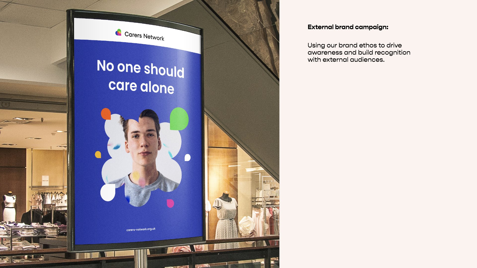
No one should care alone.
To reach and empower every unpaid carer in central London, by helping them lead healthy, fulfilling lives, with a range of practical, personal and financial support, suited to their individual needs.
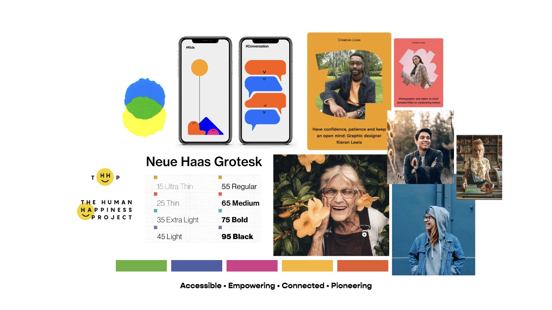
Moodboard
The iconic heart brand mark, symbolises the localised care provided by the charity.
A warm and accessible colour palette. Allowing colour combinations with enough contrast so the content is clearly distinguishable from the surrounding page.
Checked against the Web Content Accessibility Guidelines (WCAG)
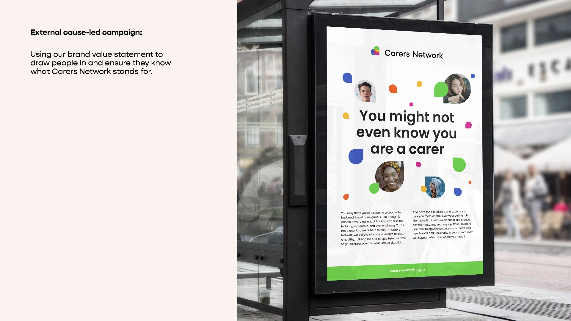
The location point pattern is a modern, flexible and friendly element for the brand to play with.
The pattern can be used in solid colour or have images dropped into it.


